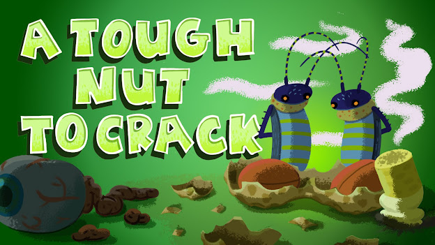
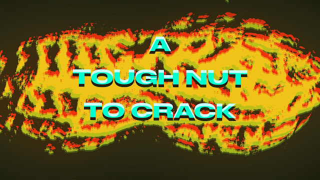
Working on the title card, not sure if I like it. I think I need to push it some more, I'm used to drawing and line work so I struggle a bit with massing in colors in photoshop, it can look a bit flat.
Here's the last rough cut of the quarter! I've added some extra time at the end for more morphing. Here's some brainstorming for the morphs And some sketches, was thinking the objects would come out of the blackness as if it were a liquid https://vimeo.com/451301813 pw:super


Comments
Post a Comment